Forget everything you ever thought you knew...
I've just had a completely new design concept, which I've spent the last hour or two researching and sketching and working some preliminary things out for, and it rocks.
I'm gonna work some designs up over the weekend so stay tuned, oh, and there's no skulls!

Thursday, 28 April 2011
Wednesday, 27 April 2011

Box mocks

Even though the back design is far from finalised, I decided to put the box into a net template and see what it turned out like. I'm enjoying this look, and can't wait to see the finished product!!!
I get ahead of myself sometimes...
Ace of Spades, Joker, Artwork card all need to be designed now, and the back design still needs finishing off, and is still in need of something in terms of revising the gears etc. to give it more pop.


Tuesday, 26 April 2011
Sign the Tally Ho petition!!! Please!
http://www.petitiononline.com/ctc1c1/petition.html
I just found this, please everyone who reads this GO THERE AND SIGN IT!!! This is very important for anyone who loves their playing cards.
Thanks
I just found this, please everyone who reads this GO THERE AND SIGN IT!!! This is very important for anyone who loves their playing cards.
Thanks
Tallys no good no more?!?
I just heard some incredibly disturbing news: apparently tallys from the new factory are horrible!!!! This is terrible news, and means I will most likely be printing on bikes now, which means a re-design for the box :-( and none of the added prestige or quality from printing onto what has always been a slightly superior playing card brand.
!!!!! Bollocks!!!!
Oh well, onwards and upwards...
Edit to add: I just got my hands on some of the new factory tallys and they spread and handle like a dream. I'm not sure what all the fuss is about? They appear to be perhaps slightly thinner than their predecessors, although not drastically so, but they fan supremely and are cut at the edges nicely etc. etc.
Does anyone have anything to add?
Monday, 25 April 2011
Distance test...

What do they look like from a distance? The overall shape and symmetry impression, artwork and intricacies aside, is incredibly important. These are looking good in my opinion, perhaps could be improved slightly though. Will get on it later in the week...
Notes to self:
- do something more interesting with the central gear/circle
- try filling the peripheral gears white and see what it looks like
- try different blade arrangements coming off the central gear with and without skulls

Slight amendments to latest skull design

I faded the wings out, put some lines over the skull so it wasn't so white, added a double border, and set the design off to the official pantone red and blue colours used by the USPCC for their Bicycle decks, although judging from the look of the boxes in front of me the tallys may be printed in a slightly different shade of red and blue, so I will have to look into this.
To be honest, I mocked up a design based on this but with no skulls, and it looked terrible, I mean so bad I don't even want to post it. It needs some serious work even to get it looking OK, so maybe that's for another time. Tonight was a slightly fruitless design session in that respect, although I am wise enough to know there's no such thing, it still feels a bit that way.
I like the skulls though, I think they add interest, I'm thinking of keeping them although I haven't made my mind up yet.

Design Features/Black Deck
Hey everyone :-)
I'm getting a lot of pageviews, and a bunch of responses to my polls as well as interest in various forums I've been posting in, but it would be nice to get some feedback here on the blog, so here's the thing:
I'm currently running with the idea of making the black deck the special magicians' deck, and leaving the red and blue decks as regular decks, in much the same way the tally ho decks are right now. This would mean including a double-backer gaff in the black deck that wasn't in the blue and red decks, possibly reworking the box design slightly to indicate this difference, and potentially coming up with one or two other cool little design features that would make the deck slightly different from the regular.
What would you like to see in this deck? What special features or ideas would you enjoy or do you think would benefit you with whatever it is you use your decks for? Performing, flourishing etc.
I'm aware of the current crop of joker and box reveals, smudged spot cards and the like, I'd be interested to hear what you guys would like to see in a new deck. Comments are open to anyone, you don't have to be a registered blogger. Let me know if you've got any ideas and we can shoot the sh*t :-)
Alex
Friday, 22 April 2011
Developed Tally Ho style box design

This is the developed design for the Tally Ho style box. I'm not saying anything, but this would look sick.

Sketch box designs

Here you can see my sketch box designs for Bicycle (left) and Tally Ho (right). I have provisionally named my deck Grinder after the gears and cogs on the back design. I like the idea of having a bit of recognition with my name on the Tally Ho design, that would be nice :-). I have always preferred the tally box to the bike box anyway, and since I've received the great news that I can print onto linoid finish tallys, I probably won't be developing the bike box.
Thursday, 21 April 2011
Wednesday, 20 April 2011
Tally Ho Linoid Finish
I've just been in touch with the lady at the USPCC who I've been talking to over the past couple of weeks to find out how much more it would cost to publish this deck on tally stock rather than bikes. I have designed an awesome custom rework of the tally box and having the deck on tally stock would add that extra prestige and appeal to the mechanics and deck collectors. Personally, I would love to print onto tallys, so I'll see what costs come back to me.
I await with baited breath, and will post my box design soon...
I await with baited breath, and will post my box design soon...
Monday, 18 April 2011
Skull concept v1.3

This evening's effort, despite a lot of time and stuff, came out looking horrible. The wings are now too prominent and need to dip back into the shadows somewhat, they've made the design far too busy and drowned out any nice symmetry the cogs were presenting. The flourishing looks nowhere near as good as the last attempt, the cogs have bigger teeth which was an intentional experiment on my part but it looks naff, the skull features are too white and need to be broken up somehow, etc. etc. etc.
Aaaarrrghhhh!!!
(edit to add: with the addition of 24hrs this design is no longer quite so bad to my eyes, but still needs big improvements)
There's a perfect design in there somewhere, just need to tease it out. The next revision will be that step closer to looking how I want it... hopefully

Sunday, 17 April 2011
Skull concept v1.2

The 2nd iteration looks something like this. I guess I went in more of a gothic steampunk direction with the interlacing cogs, it just felt right. The wings now fade in behind the machinery and hang down at the side of the skull as well as spreading out toward the centre. I tried making the flourishing more in keeping with the tone of the piece by making it thorny/tribal weave.
Notes to self: in order to improve the next revision will have :
- skulls placed slightly closer to the centre
- a central cog ever so slightly skinnier
- slightly bolder and more prominent wings
- revised flourishing
- different spoke finish to the central cog
- spoke centres in the smaller cogs
I'm enjoying the circle-heavy symmetry in this design, it should look good in the hands of a flourisher. I have this thing about a magician's deck having a back design that almost hypnotises you when the cards fan...

Friday, 15 April 2011
Skull concept v1.1

Same design as before, slightly different take, opting for slightly more Tally-like proportions than Bike. Although this version was an amendment of the first, I actually prefer the first for a number of reasons. I am confident with some working this design will be a runner, although only the first of a handful...

Skull Concept v1

Cracked out the black marker pen this evening and got to hand-drafting a version of the first skull concept I came up with. Mixed feelings about this design, part of me loves it, part of me knows it needs a lot of work before it's looking how I want it to (and part of me knows it's got skulls on it).

Buddhist Symbolism
In preparation for my drawing session this evening, I spent some time looking at various bits and pieces that I thought might be worth including, and couldn't help but notice the striking resemblence between the Buddhist mandala and the Tally Ho decks...

These playing cards are pretty much mandala back designs. Notice on the fan backs (the top deck) the circle in each corner around the central design and how similar it is to the Tibetan mandala above...

I have always considered tallys to have the most beautiful and transcendental of all playing card back designs, and this kind of makes a bit more sense when viewed from this perspective. I wonder if the artists at USPCC were aware of this when they designed the deck all those years ago?
Thursday, 14 April 2011
Hello America! ! !
The USA has just overtaken the UK as my largest audience base, so if you're reading or following this in the states: hello! :-)
Of course, a big hello and thank you if you live anywhere in the UK, Canada, Australia, Germany, Denmark, Singapore, Greece, Ireland or New Zealand as well! People from all these places are checking my blog out and it's good to have you all on board, I hope you're enjoying stopping by :-)
I've had a few days of concentrating on other stuff, but I plan to get cracking with some more design work tomorrow and will be updating the blog accordingly.
Onwards and upwards! !
Tuesday, 12 April 2011
My hot shot cut with "hand land"...
Quite possibly the hardest sleight I ever pulled off, the face-up card reveal landing on the back of the outstretched palm from a hot-shot cut. Does this earn me any sort of respect with the hardcore cardmen? I'd probably need a few takes to nail it nowadays though...
Monday, 11 April 2011
Some other traditional style back designs I like
Besides Bikes and Tallys, these are some popular traditional style back designs I quite like, particularly the kem arrows (bottom), which I think are incredibly pretty.


Sunday, 10 April 2011
Lord of the flies...

I have no intention of developing this, it's horrible. It is a pretty sick ace of spades concept though...
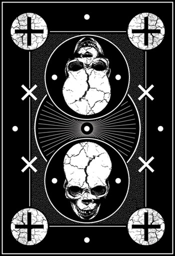
To skull or not to skull?
...that is the question.

This is a t-shirt design I came up with a little while ago for a local MMA event and I've been thinking about a symmetrical skull design over some flourishy rusty blade type stuff in this style as a concept design. Evidently it would be very agro and offend every anti-skull person's sensibilities, the only thing is, I honestly think I could work it and turn it into a skull deck to end all skull decks. Y'know? Taking this route however would clearly be opting for a very specific style and capitalising on a current trend, but I do believe plenty of people would want a truly dark and aggressive well executed skull deck, and I could be the man to give it to them.
Would I be satisfied as an artist with this outcome though? I personally love the whole skull thing, if it's done right, but would I be happy that I had kept in keeping with tradition or would I be completely selling out to a trend? That said, would selling out to a trend prove ultimately more successful?
I'm gonna design a skull deck, as one concept, whilst also designing at least one completely non-skull deck in a more traditional style as well, to keep both sides of myself (and everyone else) happy.

I had a brief play with one idea I had of using crosses as a secondary decoration, the blank spaces would be filled with flourishy stuff of course but this was a very rough and quick design that I didn't put a whole lot of effort into. I have some scribbles with much better skull layouts on them that would require some more hand-drawn stuff which I haven't yet got around to doing, one in particular with some nice eagle/angel wings on it which I think would look sweet (gotta love the wings on the back of a deck of cards).
The skull deck is definitely getting designed, and so is at least one other non-skull deck. I have a feeling I might be designing a few before settling on one to print...

This is a t-shirt design I came up with a little while ago for a local MMA event and I've been thinking about a symmetrical skull design over some flourishy rusty blade type stuff in this style as a concept design. Evidently it would be very agro and offend every anti-skull person's sensibilities, the only thing is, I honestly think I could work it and turn it into a skull deck to end all skull decks. Y'know? Taking this route however would clearly be opting for a very specific style and capitalising on a current trend, but I do believe plenty of people would want a truly dark and aggressive well executed skull deck, and I could be the man to give it to them.
Would I be satisfied as an artist with this outcome though? I personally love the whole skull thing, if it's done right, but would I be happy that I had kept in keeping with tradition or would I be completely selling out to a trend? That said, would selling out to a trend prove ultimately more successful?
I'm gonna design a skull deck, as one concept, whilst also designing at least one completely non-skull deck in a more traditional style as well, to keep both sides of myself (and everyone else) happy.
I had a brief play with one idea I had of using crosses as a secondary decoration, the blank spaces would be filled with flourishy stuff of course but this was a very rough and quick design that I didn't put a whole lot of effort into. I have some scribbles with much better skull layouts on them that would require some more hand-drawn stuff which I haven't yet got around to doing, one in particular with some nice eagle/angel wings on it which I think would look sweet (gotta love the wings on the back of a deck of cards).
The skull deck is definitely getting designed, and so is at least one other non-skull deck. I have a feeling I might be designing a few before settling on one to print...
Saturday, 9 April 2011
Designs coming soon, and "the skull debate"
OK, I spent way longer than intended reviewing those other custom artwork decks, I really want to take what I can from that and start getting some of my own designs up! For the next couple of posts at least. It's good to check out the competition, guage how good my finished designs have to be, study the host of decks that mine will be rubbing shoulders with and going toe-to-toe with, learn from the successes and shortcomings of those decks, but for the next few posts I will focus on the sketches and concepts I have been coming up with over the last week or so.
Also, a very interesting point arose on a forum called The Magic Cafe, where a poster named Artie Fufkin said:
Most enduring designs aren't "things" as such.
Even those well known cards with "things" on them are somewhat non-threatening.
Think an angel on a bicycle.
Personally, I think cards with very, very long lives generally don't have any"thing" on them, but are pure design.
Like Bee's, Tally's, Steamboats, etc.
Skulls have been done, and done, and done.
I really can't see any of them being considered interesting for more than a few years before they fall off the radar.
This gave rise to some very interesting perspectives in me, and brought to light a very important point: namely, should I have skulls in my deck or not? And maybe, the challenge for me is to create a timeless deck that will strike that elusive balance between the new style and the old school, and still have skulls on it.
The thing is, Artie is totally right in what he says, and I had already considered his point even before he made it, but, I do love skulls and I am confident that if I chose to include them in my deck design they would rock. The point is should I include them in the first place?
Let's ask skully...

Deck review: David Blaine Split Spades 1st Edition
From what I'd seen I already liked this deck before I ordered it: it oozes class, great design and a well-struck balance between modern relevance and traditional style. It came with a double-backer and a "test your powers of deduction" card with a few brain-buster type questions on. A nice touch I guess! I was a bit sore that the deck was inverted, cos I tend to hate that, but the artwork on the deck is so sweet it has kinda grown on me even though I was really looking forward to receving the regular deck :-/
Box:
Love it. Heavy use of flourishy olde-worlde tattoo style scrolls, nice typography, and as with the rest of the deck: a perfect balance between new and old. This box is a winner.


Overall verdict:
A lot of thought went into this deck, it has a lot of meaning behind the fine artwork, and the artwork is fine! Possibly my favourite of all the decks I have just reviewed, it handles great and looks great! I'm a big fan of this deck and will probably make the effort to pick a couple of regular non-inverted packs up in the future. If I have learned one lesson to take with me from the David Blaine Split Spades deck: make the artwork on my deck as fine and detailed as I can!
Box:
Love it. Heavy use of flourishy olde-worlde tattoo style scrolls, nice typography, and as with the rest of the deck: a perfect balance between new and old. This box is a winner.


Backs:
Apart from the fact they're inverted and inverted backs never look better than the originals, these backs are incredibly well designed and executed. They look great from a distance, look awesome in a packet fan, and are very fine and traditional in their style, striking an unlikely balance between that all-important boldness that makes the tally hos such a success, and that real fine style that makes a deck nice to just look at for ages.
What's really going on with that artwork?
Where to start? This deck has a lot going on! The split spades of the name are in the middle of the deck, and spell David's initials db (quite clever I suppose), there is an angel thrusting a sword through the spade, a serpent inside the spade being attacked by the sword (very biblical themes going on here people!), a bird in the middle, some lions, a crescent moon and a bunch of flourishy heraldry style stuff! In fact, if I didn't know better I'd say this back design was a lot heavier than Theory 11's Sentinels, and much quieter about it too, but that's just me! Phew...


Fronts:
The joker is an optical illusion containing an image of David "forcing the devil", using what looks like some sort of variation on Vernon's 5-card force on a 3-card monte table (what a geek I really am! or perhaps i just made that up...), which when viewed from a distance looks like a jester. The devil probably being reference to "The Devil's Picturebook", an old expression for a pack of playing cards. The Ace design is a variation on the theme of the naked Venus chick (always a winner I guess), with some nice Split Spades typography that kind of reads a different word backwards if you're creative enough. Some of the picture cards have portraits of people instead of the regular faces (don't know who they are though), David is the King of Spades...


Overall verdict:
A lot of thought went into this deck, it has a lot of meaning behind the fine artwork, and the artwork is fine! Possibly my favourite of all the decks I have just reviewed, it handles great and looks great! I'm a big fan of this deck and will probably make the effort to pick a couple of regular non-inverted packs up in the future. If I have learned one lesson to take with me from the David Blaine Split Spades deck: make the artwork on my deck as fine and detailed as I can!
Deck review: Sentinels
This was the most eye-catching deck that I ordered; the one that made me want to open it the most. First impressions: stunning deck! The spiel from Theory 11 was that the deck was loaded with arcane references to esoteric mysticism but I gotta be honest, it was pretty lightweight in this respect (sorry kids!). However, everything else about the deck was superb! Read on...
Box:
The box is lovely. This is a pricey deck, and I guarantee the box has something to do with that! Embossed fonts, metallic shimmer finishes: this box has it all! It's designed great and seems to be printed on a recycled-style card giving it a soft, bespoke feel. One gripe I would have though is that it is so modern and distinctive it burns all bridges with the traditional style boxes that all card enthusiasts have come to know and love. I'm not sure how well it will age, or even how much like a box of playing cards it actually looks like, it is very collectable though!


Backs:
The backs are pretty sick. They're white on black which I can stomach a lot more than I can black on white, but I still prefer blue or red (get used to hearing that a lot). The design is incredibly bold (compare it to the Karnivals) and looks stunning in a packet fan. It's those circles again! If anything though it is a little simple, and much like the box you get the strange feeling that you're not 100% sure if this design belongs on a deck of playing cards...
What's really going on with that artwork?
The eye of Horus inside a floating pyramid with II above it (presumably for Theory 11) and rays of illuminated light radiating around. There's some nice flourishy stuff and a couple of swords in the middle. Oh, and a small scarab crawling around the border! Nice.


Fronts:
Honestly? I don't like the joker or the ace of spades (sorry Theory 11!), the designs are just too linear and robot-like; a deck supposed to be dripping with mysticism should have gone for a more mysterious look in my opinion. The pips, picture cards and colours are completely custom which I can't help but admire, and they do look great, I just prefer the standard USPCC artworks personally.


Overall verdict:
Dreamy deck. Very heavy, cut very precisely (smoothest edges), finished superbly (fan great and feel great), they were so thick they ruined my pinky 2-grab off the bottom though! Probably wouldn't want to perform with them, would be great for playing home poker games though and the deck is very collectable as a result of how customised it is. Clearly a big winner despite me not liking every creative aspect of what it has to offer.
Deck review: Karnival
The least exciting of the decks I ordered, this one also featured straight black on white backs, which I am generally not a fan of in playing cards, however it was not without its artistic charms! It featured a double-backer and being printed on bike stock it handled great.
Box:
I'm not gonna lie, I really like the front of this box. The black on white looks great, the skeleton inside the spade design is a pretty sweet graphic, there's some nice fonts used for both Bicycle and Karnival. It looks great! However, the back is a different story :-( Perhaps it will grow on me, but I am not a fan of this back design at the moment. The side panels had some cool skull n crossbones on, which I like, and some splattered black ink, which I'm not too sure about, but were at least nice and customised.


Backs:
Bit of a let-down really! I don't like black on white as a general rule, it just looks cheap and unfinished: like a white car! It is also made up of some very wishy-washy artwork, almost the complete opposite of the Tallys, it just looks a bit of a whitewashed mess really, and from a distance looks incredibly non-descript. This design isn't without its charm, I just don't think it works on the back of a deck of playing cards in this colour scheme (or non colour scheme).
What's really going on with that artwork?
Appears to be a performing skeleton in a top hat about to take a bow, with loads of flourishy stuff behind him, and a crow sitting by his right shoulder. Great concept! Just needed to be bolder and executed slightly differently I think.


Fronts:
LOVE that ace of spades. It's mint. Nothing else to say. Well executed piece of gothic design, and it works really well on an ace of spades playing card. The joker is OK, if a little generic. Again some colour in the joker card wouldn't have gone amiss. The rest of the fronts are standard.
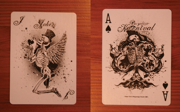

Overall verdict:
A somewhat lacklustre deck with some good ideas and some nice touches, just should have been finished slightly differently and could have been awesome! The back design is sooooo important in a customised deck of cards and this was Karnival's weakest feature.
Subscribe to:
Comments (Atom)