
Box:
I'm not gonna lie, I really like the front of this box. The black on white looks great, the skeleton inside the spade design is a pretty sweet graphic, there's some nice fonts used for both Bicycle and Karnival. It looks great! However, the back is a different story :-( Perhaps it will grow on me, but I am not a fan of this back design at the moment. The side panels had some cool skull n crossbones on, which I like, and some splattered black ink, which I'm not too sure about, but were at least nice and customised.


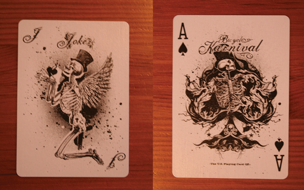
Backs:
Bit of a let-down really! I don't like black on white as a general rule, it just looks cheap and unfinished: like a white car! It is also made up of some very wishy-washy artwork, almost the complete opposite of the Tallys, it just looks a bit of a whitewashed mess really, and from a distance looks incredibly non-descript. This design isn't without its charm, I just don't think it works on the back of a deck of playing cards in this colour scheme (or non colour scheme).
What's really going on with that artwork?
Appears to be a performing skeleton in a top hat about to take a bow, with loads of flourishy stuff behind him, and a crow sitting by his right shoulder. Great concept! Just needed to be bolder and executed slightly differently I think.


Fronts:
LOVE that ace of spades. It's mint. Nothing else to say. Well executed piece of gothic design, and it works really well on an ace of spades playing card. The joker is OK, if a little generic. Again some colour in the joker card wouldn't have gone amiss. The rest of the fronts are standard.

Overall verdict:
A somewhat lacklustre deck with some good ideas and some nice touches, just should have been finished slightly differently and could have been awesome! The back design is sooooo important in a customised deck of cards and this was Karnival's weakest feature.
Is it me or should the rest of the deck follow suit (ha ha) with the ace and joker, because if it did then it would be really neat as it is its half baked.
ReplyDeletelol pretty much!
ReplyDeletei think that you should check out the Karnival assasins deck, in my oppinion it looks nicer as it has a electric blue colour on it, although i belive that the back design on these cards is nice, as for the side panels im not so sure about them, i dont like the font that is used as i belive it is too small... i think it would look better with the normal side font. anouther thing i like about these cards is the card prediction on the bar code of the box i think this is always a nice addition to a box. i also think you should check the karnaval ryguin (i think thats how its spelt) it has a beautifly white and gold back with a dragon on it. one thing i think you should consider for your cards is a double backer with one side being a different colour, i think this would be nice as it would allow for tricks like a colour changing deck.
ReplyDeleteanyway hope this helped
Joe
yeah i'll check those decks out Joe.
ReplyDeleteThe double backer in 2 colours is a neat idea, although that would ruin the houdini fooler so I'd best include a regular and a two-colour...
ideas!